


User story: As a user, I want to review the activity
Problem
Notifications and activity live in two separate places that each take over the whole page:
Notifications open a full-page list of mentions and replies. Reading one means leaving the document you were on.
Activity Feed opens a full-page feed of the space. On desktop with no space open, it shows everything the node has synced.
Users can't keep a document in view while checking what happened and the feed cards are hard to scan.
Email settings for notifications are scattered:
Desktop: a gear on the Notifications page.
Web: only the vault's account settings. The site's Notifications page has no way to reach them.
Solution
Merge both into one Activity view, scoped to the current space, with two tabs:
To you: mentions and replies.
All updates: the space feed.
The bell in the space header opens it as a right side panel. The panel can be expanded into a full page and collapsed back. Activity across all spaces isn't part of this. Discovering content across the node belongs to Explore. Everything applies to desktop and web unless stated otherwise.
Phase 1: one Activity panel and page, existing content
The goal is to merge the two pages into a panel and a full page while reusing today's notification list and feed rendering unchanged. No visual redesign of the items yet.
The panel is a document panel. Activity becomes one more panel next to Discussions, Collaborators and Directory.
Panel route: a new feed entry in documentPanelRoute (packages/shared/src/routes.ts), shaped {key: 'feed', id: <space home>, tab: 'to-you' | 'all-updates'}. On web it's encoded as ?panel=feed or ?panel=feed/all-updates, parsed in createPanelRoute.
Full page: the existing space feed route (/:feed on web) gains the same tab param.
Desktop: the panel renders in the existing PanelLayout (packages/ui/src/panel-layout.tsx.
PanelLayout's header is fixed to a title and a close button, so it gets an optional header slot. The Activity header holds the title, the To you / All updates pills, Expand, and Close.
Space pages that don't support a right panel yet (site-profile, all-documents) get it, so the bell works on every space page.
Mobile web: the panel opens in the existing MobilePanelSheet (packages/ui/src/mobile-panel-sheet.tsx). It already has the dimmed page behind, the drag handle, drag-down-to-close and Escape. It gets the same header slot.
Behavior
Bell: toggles the panel on the current page, opening on To you.
Opening and closing the panel each add a history entry, so Back closes a panel the user just opened. This matches how block comments open Discussions today.
The bell's red dot counts this space's unread notifications.
Expand: pushes the full-page feed route on the current tab.
Collapse: history back. The previous entry still has the panel open, so the side panel comes back with no extra state. Clicking the bell on the full page does the same.
Switching tabs on the full page replaces the history entry, so collapse never goes back to the other tab.
The only way to land on the full page with no previous page is on web: opening a /:feed link in a fresh tab. There, collapse goes to the site home with the panel open.
On desktop the full page is only reachable through Expand.
Tapping an item: navigates to the item, and the Activity panel doesn't stay open. Back returns to wherever the item was tapped.
A document event opens the document.
A comment opens the document with Discussions open on that comment in the right panel.
Scope and data
All updates: the existing Feed with filterResource: <space>/* (packages/ui/src/feed.tsx). The query doesn't change.
To you on web: no change. The notify server already filters the inbox to the current site (useWebNotificationInbox(siteUid)), keeping notifications whose target belongs to that space.
To you on desktop: uses the same filter as web. Today the notify server filters web's inbox with notificationMatchesSite (apps/notify/app/db.ts). Move that function to packages/shared so the server and desktop call the same code. Desktop applies it to its local inbox, which it syncs once for all spaces, and the bell's red dot count uses the filtered list.
To you, split up: NotificationsPageContent (packages/ui/src/notifications-page.tsx) is split so both the panel and the page render it. The pieces are:
the All / Unread control, keeping each platform's remembered choice.
a header row with the settings gear and Mark all as read.
the notifications list itself.
Removed
The Activity Feed button:
desktop: ActivityFeedButton in apps/desktop/src/components/titlebar-common.tsx;
web: the site-header button and the mobile menu item in packages/ui/src/site-header.tsx.
The node-wide feed: the node-feed route and apps/desktop/src/pages/desktop-node-feed.tsx.
The standalone Notifications pages: apps/desktop/src/pages/notifications.tsx and apps/web/app/notifications-page-content.tsx.
Desktop's notifications route gets removed too. Only the bell and the page itself navigate to it.
On web, /hm/notifications redirects to the current site's full Activity page on To you, so bookmarked links keep working.
Phase 2: "To you" redesign and the email dialog
Restyle NotificationListItem (packages/ui/src/notification-list-item.tsx) as a card (box):
avatar.
action line ("Peter replied to your comment in").
the document title as a pill on the next line.
the date on the right.
a tinted background while unread.
the read/unread toggle stays on hover.
Email notifications dialog: one shared dialog in packages/ui matching the mockup, used by both platforms.
Layout: bigger than today's dialog, no separate Close button at the bottom. It has a "Your email" input, plus Cancel and Set email / Save.
No email yet: the input is empty, and Set email is disabled until it holds a valid address.
Email already added: the input is prefilled. The user edits it and saves, or clears it (or clicks Remove Email) and saves.
Saving an empty field removes the config completely. There's no on/off toggle.
Saving a new address shows a toast saying a confirmation email was sent.
The desktop logic moves out of NotificationEmailSettingsDialog in apps/desktop/src/pages/notifications.tsx.
Web wires in hooks that already exist: useWebNotificationConfig, useWebSetNotificationConfig, useWebRemoveNotificationConfig and useWebResendNotificationConfigVerification in apps/web/app/web-notifications.ts. The vault's own notification settings (vault/src/frontend/components/AccountNotificationsSection.tsx) stay. Both write the same notify-server config.
If the user accepted email notifications at sign-up, the vault already sent its pre-verified email, so the dialog simply opens with it prefilled.
Phase 3: "All updates" event redesign
Events shown, per the story:
Event | Header |
|---|---|
Document created | "Alice created the document [Doc]" |
Document updated | "Alice updated document [Doc]" |
Comment | "Alice commented on [Doc]" |
Reply | "Alice replied to Bob in [Doc]" (the story says this could be simplified to "commented") |
Joined the space | "Alice joined the space" |
Citations and "added as writer" events are hidden.
Card body:
Document events have no body. The large DocumentCard preview is removed.
Comments and replies show only that one comment. There are no threads and no nested replies.
Above the comment, a green quote shows what it was on, if anything:
For a reply, the parent comment, truncated.
For a comment on a block, that block's text.
For a comment on the whole document, no quote.
Long comments are truncated with a "See all" link that expands the comment in place.
Images and videos in a comment render as small thumbnails and open larger when clicked.
Phase 4: Header tools and space indicators
These follow the story's "Header tools distribution" section.
Desktop: Chat, Bookmark and the bell move from the window titlebar into the space's header, through SiteHeader's existing rightActions slot (packages/ui/src/site-header.tsx). Explore, now with a text label, and the account avatar stay in the window bar.
Web: the site header follows the same order: Explore, then Chat, Bookmark, the bell, and the avatar.
Desktop sidebar: each joined space with unread notifications gets a red dot (apps/desktop/src/components/sidebar.tsx). The counts come from the local inbox grouped by space. It's the same data the bell already uses, grouped per space.
Bookmark: see questions below
Data model changes
There are no changes to signed or wire-format schemas (hm-types.ts, protobuf) or to the notify server's data. Only these change:
navigation route schemas (routes.ts), which are app navigation state.
client-side filtering of the desktop inbox.
Dependencies
Notification → Discussions is part of @Untitled Contact's Conversations user story. This project navigates to {key: 'document', id, panel: {key: 'comments', openComment}}, and Conversations owns what the Discussions panel shows from there.
Tests
Parsing and serializing the feed panel and tab param, and the /hm/notifications redirect.
Collapse with and without a previous history entry. Tab switching doesn't add history.
Desktop inbox filtered by space, with the unread count per space.
The new navigation targets in notificationRouteForPayload and the feed.
Email dialog states: no email, prefilled, cleared and saved, verification pending or expired.
Phase 3: detecting the quote embed and the card header per event type.
Rabbit holes
Space pages without a right panel. Adding panel support to site-profile and all-documents touches their route schemas and layouts. Could be costly.
feed.tsx is about 1,100 lines and shared with the document Activity, Versions and Citations panels. Phase 3 adds a new card component next to it instead of threading conditions through every branch.
Truncating rich content. Comments are block trees (lists, embeds, images), so text line-clamp doesn't apply.
Clip by height and measure overflow with a ResizeObserver to decide whether "See all" shows.
Ensuring mobile UX is solid
Questions
The full-screen design screenshot shows only the feed, with no To you / All updates pills. Should be added to the design. Yeah! your are right I just replaced the image
Where do bookmarks go? The story lists Bookmark as space-related and places it in the space header, but the meeting notes say it moves into the account menu. By now it can stay together with the bell and the chat icon. Horacio wants to move drafts and Bookmarks to the avatar menu but still to be discussed.
Remember to apply a different design to Explore, not just with the icon by with the word and move it to the left to differentiate from the rest.
Should the Activity sheet open at about 60% height, as in the design screenshot, while other sheets stay at 90%? Is the Expand button only way to make it full screen, or should dragging the sheet up be implemented? .Yeah we can do 90% as well, but I think we should test, cause on comments it might make sense to part of the doc. It would be great to implement this component to drag and drop up and down.
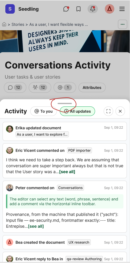
Show replies as "replied to Bea in", or simplify to "commented on" as the story suggests? If we can be more accurated on the information will be great. If is is part of a thread "replied to..." if it is a comment on the document "commented on".
Do you like what you are reading? Subscribe to receive updates.
Unsubscribe anytime